Starting April 21st, Your Organic Traffic Could be in Jeopardy
While there are very few people who click beyond page 1 of search engine results to find what they’re looking for, the vast majority of searchers will rarely make it past the first few listings in Google. If you’re on page three or four, chances are slim that your potential customer will ever lay eyes on your website.
If you do not have an ongoing Search Engine Optimization (SEO) campaign, chances are your bank’s site may already need some tweaking as the rules are constantly changing. If this is the case, ask yourself, “How does my mobile site stack up? ”.
If a customer is viewing your bank’s site on a smartphone, is the site functional? Is navigation simple and are buttons easy to click? Can you read information without having to manipulate the screen size? You need to be able to answer these questions with a resounding YES prior to April 21st.
Mobile-friendly is no longer an option, but a necessity
At the end of February this year, Google unleashed a storm that will leave many websites out in the rain. In simplest terms, these changes mean that if your site is not mobile-friendly, you are bound to lose a significant amount of free site traffic (organic traffic) from this major algorithm update set to be released on April 21st.
Now let’s back up for a second. What exactly does a “mobile-friendly” website entail? If you take a look at your website on a desktop computer now and then try to imagine what it would look like compressed on a tiny screen, chances are the text will be too small to read, links will be hard to click and the overall experience may in fact frustrate some of your potential customers. A mobile-friendly website is a slightly different version of your website that is optimized to provide a fantastic user experience. Examples of mobile-friendly elements are bigger text of crucial information (phone numbers, address, etc), links that are far easier to click with our big thumbs, a very fast user experience, and more.
Betting on the return of the flip phone or bag phone
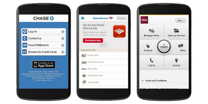
Even if google were not changing it’s algorithms, it’s just good business sense to have a site that is mobile-friendly. Don’t sit around complaining that you can’t match the technology of the big banks when there are some areas wher![]() e you can most certainly match them. For instance, the image at the top of this blog are screen shots from three large banks’ mobile sites that any bank could quickly and cost effectively implement. There is no reason why your site shouldn’t be mobile-friendly unless your betting on the return of the analog flip phone or bag phone.
e you can most certainly match them. For instance, the image at the top of this blog are screen shots from three large banks’ mobile sites that any bank could quickly and cost effectively implement. There is no reason why your site shouldn’t be mobile-friendly unless your betting on the return of the analog flip phone or bag phone.
Why the change for mobile sites?
This move aligns perfectly with overall usability because at the end of the day, Google only wants to display websites that are helpful to their searchers. So now, given that there is less than 1 month to go until April 21st, is your website ready to weather the mobile-friendly storm?
Concerned about this change affecting your bank site adversely? We can perform a Free assessment to determine if your website is mobile-friendly or not.


